Showing posts with label pastel. Show all posts

05 July 2021

Summer pastel series


Every time I travel to Cape Cod for a summer vacation I feel revived -- there truly is something about "Cape Light," as many artists and photographers refer to it.  Colors seem more vivid, the light almost crystalline in its clarity.  Unless, of course, if it's raining or foggy!  

This year we were right on the beach so to watch the colors of the various beach grasses and marshes was perfect -- early morning, midday, sunset and dusk.  This is a pastel-and-watercolor sketch, a mix of mediums that I find fun to work with.  I use Strathmore Bristol paper, which is usually used for graphic design and manga artwork.  But I like the way it holds the watercolor and allows me to overlay the layers of pastel. 

I'll be working on more of these sketches, working now from memory, and will soon be uploading this painting to my space on Fine Art America soon if you're interested in a print, a notecard and more!

Happy Summer!

"I hope to make pictures like I walk -- under a spell, an instinct of motion,

a kind of knowing that is essentially indirect and sideways."

(Ellen Meloy, Anthropology of Turquoise)

02 November 2020

Start your hygge?

 Autumn has hit hard here in New England.  It seems as if just the other day it was in the 70s and sunny with roses still blooming in the garden -- and then wham!  Cold, cold, cold.  2020 strikes again, I suppose.

So what to do to maintain a positive outlook?  To keep plugging along when almost everything in the news wears you down?  Well, I'm adopting -- or at least will try -- to take the Danish approach of "hygge"!  

Earlier this summer I stumbled on Helen Russell's wonderfully funny yet informative book.  It was truly fascinating how this little country has the highest rating for happiness, although Russell was quite frank about the "negative" aspects of living Danishly, as well. 


But I'm trying to embrace the idea of hygge -- to enjoy the simple, comforting aspects of winter.  And with the pandemic flipping into high gear once again, maybe this is the best approach for the coming months.  So, I'll be looking to cook more, read more, wrap myself in wooly socks and throws, whip out those knitting needles and crochet hooks to help sustain some type of positivity.  How about you?  Any plans for survival?  

In the meantime, I spent some hours sifting through artwork and such, posting to my Red Bubble store and thought I'd share some shots with you, several of which are colorful and summery in feel.  

Cape Cod Marshes (pastel on paper)


A throw pillow to break up the dreary winter months! 


Melon Freefall (acrylic on paper)       

A new journal for 2021?

Sail along the Coast (watercolor on paper)

Time to get a new apron?


Nothing like a bit of color and fun to lighten the mood, right?   As far as I'm concerned, anything to help get through the coming weeks and months.  So, stay warm and keep smiling (even if it is behind your mask).   I've always loved this quote.  It seems to capture that hygge attitude almost three hundred years earlier --

Barn's burnt down -- now I can see the moon.

               Mizuta Masahide, Samurai (1657 - 1723)


06 April 2015

And yet we still wait:


pastel and watercolor; 5"x7"

winds sink 
and scour new green --

whipping heads
so delicate,

wet, dirt-encrusted debris
revealed from under shrouds
of snow,

at my feet 
snow drops tremble --

is it not glorious?

10 August 2014

Seasons of Light

Does the season dictate what we paint?  Or is it the play of light and shadow?  Or both?   These are small sketches I did over the past year -- some were painted in the winter/early spring in my travels up through Massachusetts, Vermont and New Hampshire --  

Late Sun on Snowfields (mixed media; 8"x10")

Distant Mountains (mixed media; 8" x10")

While these were painted earlier this summer at the Cape --

Sand Dunes and Marshes (watercolor; 5" x7")

Cape Light (watercolor; 5" x 7")

Tracking the Sun (watercolor; 5" x 7")

Why landscapes and at other times abstracts?  I'm beginning to think that it may have much to do with the light.  In the winter and autumn, the light plays across the land, catching out colors and contours.  While in the summer, one often can't even see the land because your sight is overwhelmed with the intense light and the heat waves shimmering off the surfaces of water, sand and marshes.

Now I'm watching the late afternoon skies more often, noting the lowness of the sun, the cast of shadows stretching just a bit more across the gardens and lawns.  Temperatures have dropped at dusk and there's the need for a sweater or light jacket.

We have moved from the pastels of spring to the intense yellows and reds of late summer.  In a few weeks, the persimmons and ambers of autumn will take their place, along with the smell of woodsmoke and hot cocoa.  

But for now I'll take what I see, shift my toes in the cool grass and sip at a glass of chilled white wine while I splatter paints across the blank white page . . . 


In nature, light creates the color. In the picture,
color creates the light. 
Hans Hofmann 


04 March 2012

Working Quick, Working Small

It's been so long since my last posting!  I just took on a new position and have been wrapped up in learning a new environment, a new staff and new communities. But today on a quiet, chilly gray Sunday, I decided I needed to do some catching up --

Is this my "Blue" phase? Not sure but this winter seemed to bring out blues in a variety of hues and values. For Wassily Kandinsky, blue was the color of spirituality: the darker the blue, the more it awakened human desire for the eternal (On the Spiritual in Art).  Kandinsky also developed a theory of geometric figures and their relationships, claiming that the circle was the most peaceful shape and represented the human soul.


Circular Thinking
acrylic on paper, 6" x 8" 
 mat opening of 3.5" x 5.5"; 8"x10"


Perhaps that helps explain the prevalence of blue -- the need to keep calm, to focus on serenity amidst a chaotic period of life.  I found I had to work quickly, sometimes just on a smaller scale; otherwise, I'd never had done anything. When going through interviews and waiting to hear the results, it was hard to concentrate on anything else. The creative life was shoved off to the side; not a good thing, but I had no choice. So these mini-works were about all I could handle.

Racing the Storms
oil pastel on bristol paper
3" x 5"


And I find that as I look back over these paintings and sketches, I like what came through -- nothing belabored, heavy and dull -- at least, in my opinion. The funny thing is that I have so many more that I unearthed from the piles stacked on the shelves or in portfolio bags -- pieces of larger paintings that just didn't make the grade, that I salvaged by cutting up and matting.


Ghost Barn
watercolor and pastel on Cartiera Magnani paper
6" x  6"

Why do larger paintings sometimes not work while the smaller bits do?   I'm not sure -- perhaps the brain can only take in and register pieces of a whole. Or is it that the artist is truly working on several paintings within the larger one?  Is it the push-pull between the right-brain and left-brain processes that seem to create this phenomenon?

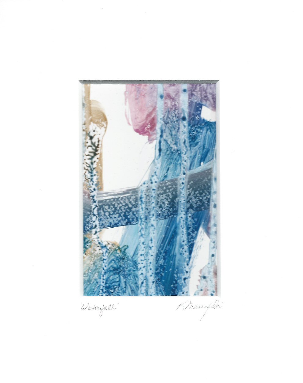
Waterfall
6" x 8", acrylic on Yupo paper
matted to 8"x10" with 3.5"x5.5" opening

And then there is the color, again pushing through, insisting on a presence whether you want it there or not. Working quickly, working smaller -- spontaneity, process over detail -- swift movements that evoke a kinetic energy that inevitably calms . . .

03 February 2012

Variations on a Theme

How does one envision an image? How does one interpret that vision?

I love the coastline and spent many summers on the beaches of Long Island, NY where I grew up. Not only summers but every season really and in all types of weather. Actually, Long Island is like one giant sandbar, as my Dad used to joke!

I'm not sure if it was the wide open spaces of the beaches or the vast skies or that thin scrim of a horizon line between ocean and sky that I loved the most. Or perhaps the dunes and the waves. In the midst of February, all these images and smells and sounds fill my head.  These two works seem to evoke some aspect of those memories, yet in very different ways and methods --

Coastal Haze
This is a fairly small work done on Wallis pumiced paper with acrylics and touches of pastel, done quickly with large mop brushes.

And this one was painted with oils on a thick heavy 200lbs. acrylic paper by Strathmore, which sold a few months ago at the Hartford Open Studio weekend.

Wetlands, Orleans MA
Different mediums, different approaches -- and yet both seem to capture a sense of the coast and surrounding wetlands. And I suppose that's the best one can hope for --

In summer, the song sings itself.
~William Carlos Williams

03 August 2009

Experimenting with Pastels

"Last Shadows on the Dunes"
(pastel on Canson paper, 9x12)

There are times when one must navigate away from the familiar, like an old viking (!?), and explore new territories. For me, pastel is that territory.

It's scary because the marks are immediate. You truly cannot erase pastel -- it just gets smudgy.

It's messy and dusty. Here's a hint: never wear white shorts when working with pastels. I learned that yesterday -- duh.

So pastels are one of those areas I've stayed away from. But I love pastels. Every time I walk through the art store, I linger over those thick chunky sticks of pure color. I subscribe to the magazine Pastel Journal. I visit pastel artists' blogs -- two of my favorites are Casey Klahn and Marla Bagetta.

Then what's the problem? Dunno . . .

Yesterday, after spending hours making necklaces for a festival coming up in October, I took a break and pulled some paper over, opened up my box of pastels (yes, I do buy them) and spent about two hours working on this small painting.

This time I moved at a slower pace; I used fixative between layers, trying to build up those big juicy masses of color I so love.

It's a start. Another thing I like about pastels is that it is a very portable type of art-making.

This painting is worked from an inversion of an oil painting of mine -- Twilight on the Marshes. I had digitally altered it to another range of hues/saturations after converting it to a negative format. This helped me "see" it in a different way and gave me a new path for colors, etc.

Will I keep working with pastels? I'm not sure the viking in me is brave enough. I just have to remember not to wear white . . .