Showing posts with label watercolor. Show all posts

05 July 2021

Summer pastel series


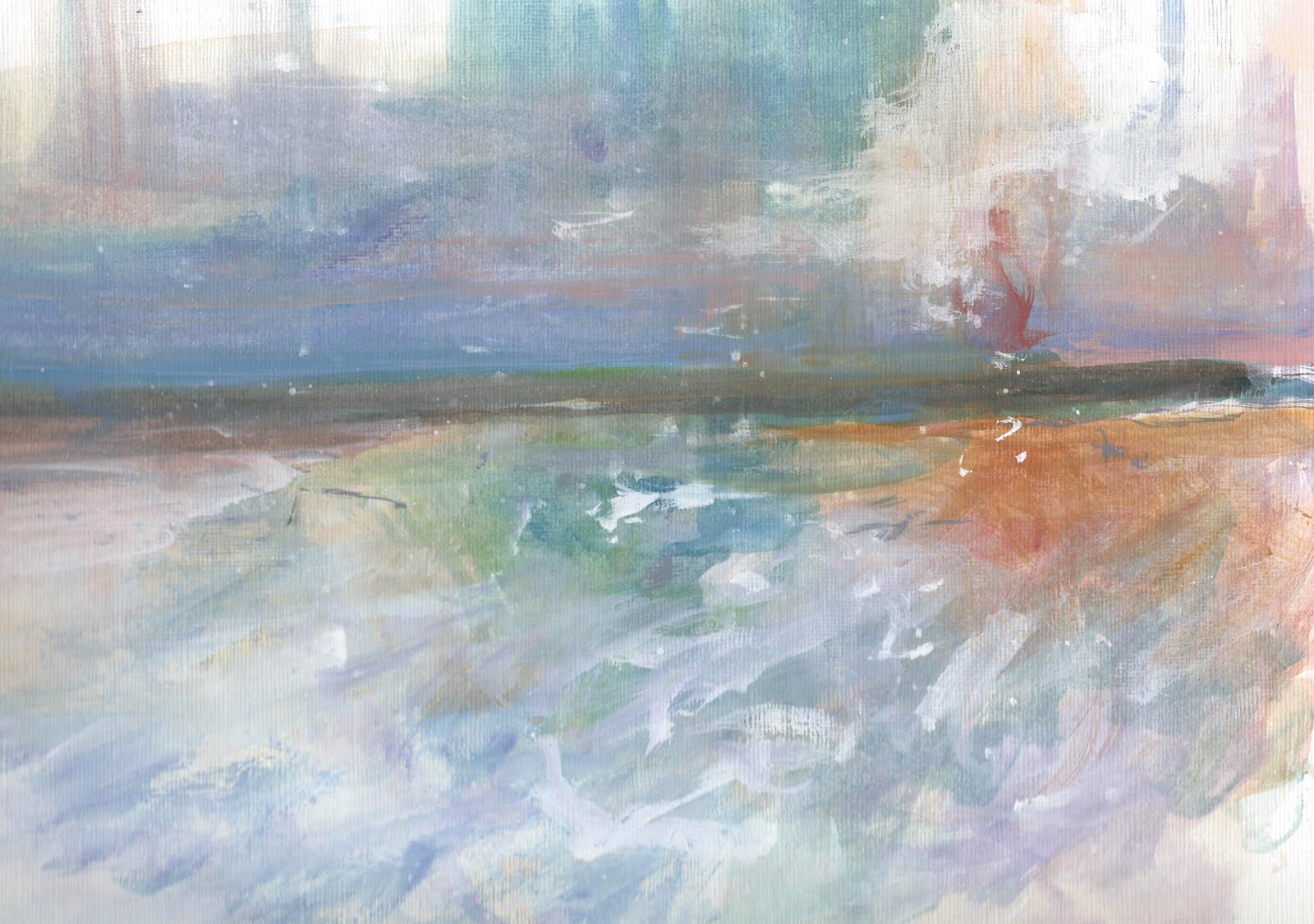
Every time I travel to Cape Cod for a summer vacation I feel revived -- there truly is something about "Cape Light," as many artists and photographers refer to it.  Colors seem more vivid, the light almost crystalline in its clarity.  Unless, of course, if it's raining or foggy!  

This year we were right on the beach so to watch the colors of the various beach grasses and marshes was perfect -- early morning, midday, sunset and dusk.  This is a pastel-and-watercolor sketch, a mix of mediums that I find fun to work with.  I use Strathmore Bristol paper, which is usually used for graphic design and manga artwork.  But I like the way it holds the watercolor and allows me to overlay the layers of pastel. 

I'll be working on more of these sketches, working now from memory, and will soon be uploading this painting to my space on Fine Art America soon if you're interested in a print, a notecard and more!

Happy Summer!

"I hope to make pictures like I walk -- under a spell, an instinct of motion,

a kind of knowing that is essentially indirect and sideways."

(Ellen Meloy, Anthropology of Turquoise)

02 November 2020

Start your hygge?

 Autumn has hit hard here in New England.  It seems as if just the other day it was in the 70s and sunny with roses still blooming in the garden -- and then wham!  Cold, cold, cold.  2020 strikes again, I suppose.

So what to do to maintain a positive outlook?  To keep plugging along when almost everything in the news wears you down?  Well, I'm adopting -- or at least will try -- to take the Danish approach of "hygge"!  

Earlier this summer I stumbled on Helen Russell's wonderfully funny yet informative book.  It was truly fascinating how this little country has the highest rating for happiness, although Russell was quite frank about the "negative" aspects of living Danishly, as well. 


But I'm trying to embrace the idea of hygge -- to enjoy the simple, comforting aspects of winter.  And with the pandemic flipping into high gear once again, maybe this is the best approach for the coming months.  So, I'll be looking to cook more, read more, wrap myself in wooly socks and throws, whip out those knitting needles and crochet hooks to help sustain some type of positivity.  How about you?  Any plans for survival?  

In the meantime, I spent some hours sifting through artwork and such, posting to my Red Bubble store and thought I'd share some shots with you, several of which are colorful and summery in feel.  

Cape Cod Marshes (pastel on paper)


A throw pillow to break up the dreary winter months! 


Melon Freefall (acrylic on paper)       

A new journal for 2021?

Sail along the Coast (watercolor on paper)

Time to get a new apron?


Nothing like a bit of color and fun to lighten the mood, right?   As far as I'm concerned, anything to help get through the coming weeks and months.  So, stay warm and keep smiling (even if it is behind your mask).   I've always loved this quote.  It seems to capture that hygge attitude almost three hundred years earlier --

Barn's burnt down -- now I can see the moon.

               Mizuta Masahide, Samurai (1657 - 1723)


03 December 2015

Small surprises

Been home today with a tough headache and just plain weariness. Roaming the house, at loose ends, thinking about work . . . no way to shut down the mind even though the body is screaming, "stop!" 

Finally wandered into my 'studio' area (actually was doing a load of laundry) and started to poke around in the files on my computer, drifting through various scans when I stumbled on a small file of pastel and watercolor sketches. God, when did I do those? And, more importantly, where are they? 

Surprisingly, I've always steered clear of pastels, although I do love the density and richness. Several years back I tried my hand, and I think I wrote on this blog about how I stupidly wore white shorts while using pastels -- a true 'duh' moment! 

But I keep returning to favorite artists, such as Casey Klahn and Deborah Stewart.  And, of course, one must revel in the pastel works of Wolf Kahn, so there must be something in pastels that stirs my feeble brain.

Earlier this summer I found that working small and quick while using watercolors as the underpainting truly gave me the effect I was seeking with pastels. Somewhere in this mess, I need to find those sketch books, perhaps tack them up on my inspiration wall, pull my head out of the dense cloud of work and the threatening depression of winter and sink myself into those colors -- 

Sunset on the CT River

The Stillness of Pines at Dusk

A Continuous Flow

High Summer along the River

06 April 2015

And yet we still wait:


pastel and watercolor; 5"x7"

winds sink 
and scour new green --

whipping heads
so delicate,

wet, dirt-encrusted debris
revealed from under shrouds
of snow,

at my feet 
snow drops tremble --

is it not glorious?

20 December 2014

Winter Solstice Eve


winter pond

snow fields

New England Barn

snow rose

North Canton Horse Farm

winter passion

Blessings on this eve
of Winter Solstice


10 August 2014

Seasons of Light

Does the season dictate what we paint?  Or is it the play of light and shadow?  Or both?   These are small sketches I did over the past year -- some were painted in the winter/early spring in my travels up through Massachusetts, Vermont and New Hampshire --  

Late Sun on Snowfields (mixed media; 8"x10")

Distant Mountains (mixed media; 8" x10")

While these were painted earlier this summer at the Cape --

Sand Dunes and Marshes (watercolor; 5" x7")

Cape Light (watercolor; 5" x 7")

Tracking the Sun (watercolor; 5" x 7")

Why landscapes and at other times abstracts?  I'm beginning to think that it may have much to do with the light.  In the winter and autumn, the light plays across the land, catching out colors and contours.  While in the summer, one often can't even see the land because your sight is overwhelmed with the intense light and the heat waves shimmering off the surfaces of water, sand and marshes.

Now I'm watching the late afternoon skies more often, noting the lowness of the sun, the cast of shadows stretching just a bit more across the gardens and lawns.  Temperatures have dropped at dusk and there's the need for a sweater or light jacket.

We have moved from the pastels of spring to the intense yellows and reds of late summer.  In a few weeks, the persimmons and ambers of autumn will take their place, along with the smell of woodsmoke and hot cocoa.  

But for now I'll take what I see, shift my toes in the cool grass and sip at a glass of chilled white wine while I splatter paints across the blank white page . . . 


In nature, light creates the color. In the picture,
color creates the light. 
Hans Hofmann 


21 January 2013

A Sense of Place

There are some places that live with us. Perhaps we grew up in these special spaces; perhaps we live in them currently. They become a part of our psyche, like a silent tapestry that abides within . . .

For me, it is the oceans, rivers and lakes of the Northeast. I grew up on eastern Long Island and could walk to the beach from my house. My husband and I, when we were dating, spent most of our free time at the beach. Every summer we head for Cape Cod and our children, now grown, follow in the familiar path to the Cape.

Every autumn we head north to Maine and walk the coastline, drinking in the wide open spaces, the quicksilver skies. On my daily commute I pass along the CT River and witness amazing turns of light and of seasons.

These sketches and paintings are my attempts to capture those moments . . .


Encroaching Storm [watercolor and gouache]


Spindrift, West Dennis [watercolor and gouache]


Thunder Skies [watercolor and gouache]


“A place belongs forever to whoever claims it hardest, remembers it most obsessively, wrenches it from itself, shapes it, renders it, loves it so radically that he remakes it in his own image.” 
Joan Didion

12 January 2013

Pastels Redux

So many times I've tried to work with pastels, and so many times I have given up in frustration, moving back to oils or acrylics.  Just could never seem to get a handle on this medium.

And yet over the years I have admired so many pastel artists' works; I even subscribe to Pastel Magazine.  Then, this morning while having my first 400 cups of coffee, I read through the latest issue that just arrived yesterday.  I was bowled over once again by the beauty, the softness, the fine nuances of the colors. 

So while taking a morning walk, I mentally charged myself to go back to the drawing board, literally.  This time I would not dawdle with accuracy; I would aim for swiftness and mass, huge chunks of colors on a watercolor background, working into the wetness for that lovely smudged aspect.

Who are my favorite pastel artists?  First and foremost, Wolf Kahn.  I have several of his books and review them frequently.
Swift Skies, 6" x 9"
Other pastel artists I have been following over the years is Casey Klahn, Marla Baggetta, Deborah Stewart and Carolyn Caldwell.  I think Bagetta's influence is quite obvious on this piece below.  She has several vidoes on YouTube, which truly inspire yet also put you at ease in her laid back attitude toward making art.

Morning in January, 5" x 7"

I found that today, after several hours of working quickly, that I liked working on 150 lbs. heavy bristol paper by Canson, usually used for comic and manga drawing. It held up well under the watercolor and multiple applications of the pastels. 

High Summer, 8" x 10"

As I moved, I found myself becoming braver about using my fingers and the sides of my hand to smooth and smudge. Pastels are quite forgiving and change is possible without losing momentum. 
 
Early Autumn on the River, 5" x 7"

How do I feel after today's attempts? Not too shabby! I think I may have finally moved to another stage in my development using pastels. They are immediate; they are forgiving and they are certainly easy to transport for quick sketches, etc. 

I think I will continue to pursue pastels, especially during these dreary months of winter. To have this array of lush colors before me is the best tonic.  

I don't think I have enough, though.  Guess I better take a trip to the art store, don't you?


02 August 2011

A Summer Evening with Twombly

Over the years how many artists do we encounter and fall into a deep, passionate love of their works?  Whether old masters or contemporary painters, I'm sure we have many -- or perhaps only a few that evoke such devotion.  For me, there are a few: Frankenthaler, Rothko, Turner, Inness, Matisse, Mitchell, Diebenkorn . . . 

. . . and Cy Twombly was one.  Only last month I stumbled on a wonderful short clip on YouTube -- Cy Twombly: the Lepanto Cycle -- of an exhibit of his work in Germany.  I replayed it over and over just to gaze upon the massive canvases, to listen to the amazing soundtrack that seemed to float and carry Twombly's images across the screen, a composition by Giovanni Battista Pergolesi.  Twombly created these twelve paintings for the 2001 Venice Biennale. 

The other evening while sitting in the garden watching flowers dance in the soft evening light, I was reminded of Twombly and decided to pay my humble respect --


poppies
watercolor, gouache, charcoal


profusion
watercolor, gouache, charcoal

A recent issue of RA carried a wonderful article about the exhibition of Twombly and Poussin at the Dulwich Picture Gallery in London, a combination that at first strikes one as a bit odd -- but it intrigues the imagination, without a doubt.

august evening
watercolor & gouache


There shall be eternal summer
in the grateful heart.  
~Celia Thaxter


May evening find you gracious and fulfilled.
May you go into the night blessed, sheltered and protected.
May your soul calm, console and renew you. 
a Celtic blessing


18 February 2011

Small Studies

Color Study I
(gouache and ink, 6"x6" on Magnani Acquerello paper)

Available as greeting card  -- Click here
Available as a matted print -- Click here


Color Study II
(gouache on Magnani Acquerello paper, 6"x6")

Available as a greeting card -- Click here
Available as a matted print -- Click here


Color Study III
(gouache on Magnani Acquerello paper, 6"x6")

Available as a greeting card -- Click here
Available as a matted print -- Click here


Threshold
(watercolor and gouache on 200 lbs. acrylic paper, 9"x12")

Available as a greeting card -- Click here
Available as a matted print -- Click here


working small, touching water to paper
colors creep seeking points to merge or not,
to blend or not.

scratch the surface,
stumble,
stay with the clumsy gesture
for it is true.

outside whiteness falls
into puddles of black ice,
the sound of winter
no sound . . .

10 May 2010

The Best Laid Art Plans . . .

There's something about watercolors -- the way they capture and reflect light -- and their simplicity that makes them seem so much more accessible than oils.  Maybe it's the traditions associated with watercolors, for in years past it was a popular pastime, an everyman's sport to traipse about in the woods and meadows with a small sketchbook and tiny pans of paints.  And it wasn't just the men -- women took up watercolor painting and sketching with a passion, too.  In the days when there were no television and radio, painting was a leisure craft taken up by many around the world.


It's also surprising to consider who painted watercolors -- certainly J.M.W. Turnerwas pivotal in making watercolor painting a most modern medium --
very little detail, purely atmospheric in his rendering -- incredible!   John Singer Sargent who we associate with Newport and the heady world of the Astors and Vanderbilts, created beautiful watercolors while traveling
throughout Italy, and especially of Venice, where again the light and water reflections were magical.   Other watercolor painters that I love to pour over for the simplicity and delicacy of their works are the Scottish painter, Charles Rennie Mackintosh

 and the French painter, Raoul Dufy, whose paintings always remind me of the backdrop of the famous finale dance scene in the movie An American in Paris--


Well, contrary to my plans for painting outdoors this weekend, high winds and thunderstorms threw a bit of a stumbling block to painting outside!  So I stayed safely tucked indoors and worked on some watercolors using books and photographs I keep handy for such occasions.  This is one I am particularly pleased with -- I found him in one of my books on Scotland.  Bit of a skeptic, wouldn't you say?


 The Vest
watercolor on vellum bristol paper
9" x 12"

I have been painting watercolors on vellum bristol paper, experimenting with the "viscosity" factor.  The vellum allows the paint to float more, leaving an open-ended type of finish.  At times it can be aggravating, but I'm learning to watch and wait, not to be so quick with the paper towels, to let the paints creep and crawl around a bit more then usual.  Next I want to try working with watercolor paper that's been coated with gesso or pumice gel -- I'm curious about how those surfaces will affect the paints.

As Rosanna Dana of SNL used to say, It's always something . . . !

18 June 2009

Art Blahs . . .

Reaching towards the Sun
11" x 9"
Mixed Media on Fabriano Watercolor Paper


We are now into our second week of (almost) non-stop rain. Has the East Coast switched with the Northwest Coast? I had to post this painting as I had painted it a few weeks ago when we were in the midst of an early summer heat wave -- hard to believe!

These were some early irises in my garden, tall and sweeping yet delicate. They only last about 10 days before fading away. I so wanted to "capture" them and now with all this rain and cold I am so glad I did!

Although this painting may be a bit too PINK, I am happy with the fluidity and looseness of it all, which was what I was striving for, combining the watercolors with wax and oil pastels. I had been viewing an excellent DVD by the British artist Shirley Trevena and was impressed with her experimental attitude towards watercolor and other media. It certainly made me think differently about florals, still life, etc.


And now I've added myself to an art challenge by Vivian Blackburn -- this one is about trees. I love trees and have been fascinated by their myriad shapes and textures, their colors and ability to sustain other life forms. Hopefully I'll be able to add some interesting work to the challenge!


08 June 2009

Evoking the Intangible in Art

Curve of the Wind
8.5" x 11"
watercolor, wax, oil pastel & pastel

How do we evoke the intangible in art, in painting or drawing, in oils or watercolor? How do we capture an emotion, such as yearning or despair? Art is such a silent language. It seems simpler in writing or poetry, even in music. I realize I'm simplifying drastically, but still . . .

With this watercolor/mixed media painting, I was consciously going for that free-spirited thing -- outside the window early summer had erupted and I believe the season persuaded my choice of colors and of the large, scrawled curving lines and marks. How could it not?

I was experimenting with the use of wax crayons and oil pastels, as well as soft pastels in combination with the watecolors, beforehand and while wet.

It was difficult to "control" what was occuring, but that was my intent -- to allow the materials and mediums to show me the way, to guide me and surprise me.

This painting is truly a celebration of the season:

Warm summer breezes
whip my hair
the colors of birdsong spin
through the trees

05 June 2009

Rainy Art Day

"Burst of Sunflowers"
11" x 9"
watercolor, oil pastel and pastel


I thought this watercolor painting of sunflowers would brighten things up a bit here in blogland -- so much energy and color! It's been raining here in New England, on and off, for weeks now. 2 or 3 days of sun and warmth, then a week of clouds, wet and cold. Everyone is wondering where summer is. Hard to believe Summer Solstice is only 2 weeks away.

This painting, also a watercolor with oil pastel marks, is probably more indicative of our current weather situation, although I envisioned it as a night scene in the dunes --

"Moon Walk in the Dunes"
10.75" x 10.75"
watercolor, oil pastel


It's interesting how the use of color can either be reflective of our mood, the environment/weather or can convey, without a word, these sensibilities.

Art is truly the silent language among peoples and across time. I liken it to poetry and especially haiku. Laden with potency in such a small space on a blank paper or canvas. Nuances must be traced and interpreted slowly, with care.

At least sometimes -- when viewing the Sunflowers above, I'm sure the response time is much quicker and immediate, mainly because of the color. It's bodacious and bold. It must be because a sunflower's life is short but potent, filled with hundreds of seeds soaking up that sunlight.

While sand dunes are quiet. They slumber by the sea, inviting slow walks and soft caresses behind sea grass, especially if those walks are taken with a partner at night! So these colors are muted with open spaces interspersed throughout the painting, places for the eye to rest, just like those lovers.

Ah, I wax poetic! I wonder if I could write an haiku about these two artworks? I'll be back . . . !